
When No-Code Meets Human-Centered Design:
Wizflow
My Role
Lead Product Designer
UX UI Designer
UX Researcher
Company
Dreamplan io
Timeline 2025-26
12 months - ongoing
Deliverables
UX Research & Product Architecture
Interactive Prototypes & Design System
Visual UI Components
Redesign web app concept
Overview
This case study explores the design of Wizflow, a web-based, AI-powered no-code platform that enables teams to build interactive, automated workflows through a visual editor.
Wizflow is used primarily by banks, pension funds, and regulated organisations to create secure, compliant chatflows and digital self-service journeys. While the underlying technology is complex, the product vision was clear:
make advanced automation usable by everyday business users — not engineers.
As Lead UX/UI Designer, I was responsible for transforming a highly technical system into an intuitive, visual, and approachable product. This involved shaping the platform’s interaction model, visual language, and design system from the ground up — ensuring that non-technical users could confidently build, manage, and iterate on complex flows.
This project demonstrates how strong UX thinking can turn enterprise complexity into clarity.
Mission
The focus was on designing a platform that feels intuitive, trustworthy, and empowering for non-technical users working in regulated environments.
The goal was to remove technical barriers and cognitive overload — enabling teams in banks and pension companies to design and launch secure chatflows quickly, confidently, and independently.
Problem
Wizflow’s early product was powerful but difficult to use.
Its flexibility came at the cost of usability — making it feel technical, abstract, and intimidating for everyday users.
Key challenges included:
Complex logic and data structures exposed too early in the user journey
A lack of visual hierarchy when building flows
Limited guidance for non-technical users creating chatflows
No shared design language or system across the product
For clients in banking and pension sectors, this friction slowed adoption and increased reliance on technical support — undermining the promise of a no-code platform.
The design challenge was to reduce complexity without reducing capability.
Research
I worked closely with customers and internal teams to understand how users actually approached flow creation.
Research Activities
User interviews with non-technical users in banks and pension companies
Continuous feedback loops with customer success and sales
Observation of real-world flow creation sessions
Analysis of support requests and usability friction points
Key Insights
Users think in steps and conversations, not logic trees
Confidence drops sharply when users feel they “might break something”
Visual feedback and validation are critical for trust
Users want guidance — not automation that removes control
These insights became the foundation for both the interaction model and visual system.
Ideation
The ideation phase focused on a core reframing:
How might we let users design complex workflows the same way they would sketch a conversation on a whiteboard?
Key ideation directions included:
A visual, node-based canvas that mirrors human thinking
Modular “entities” that encapsulate complexity behind simple interfaces
AI as a supportive assistant, not a decision-maker
Progressive disclosure of technical depth
This approach allowed power users to go deep — while keeping the default experience approachable.We began with collaborative design workshops involving stakeholders from product, data, and marketing to align around the core question:
How might we make financial planning feel approachable, human, and empowering — while keeping the complexity behind the scenes?
Solutions
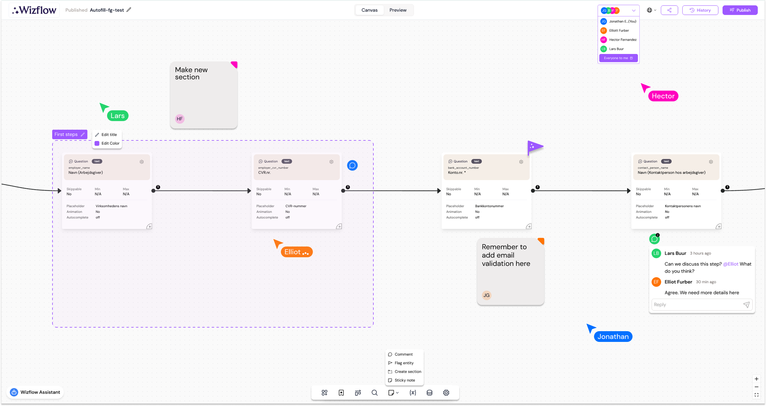
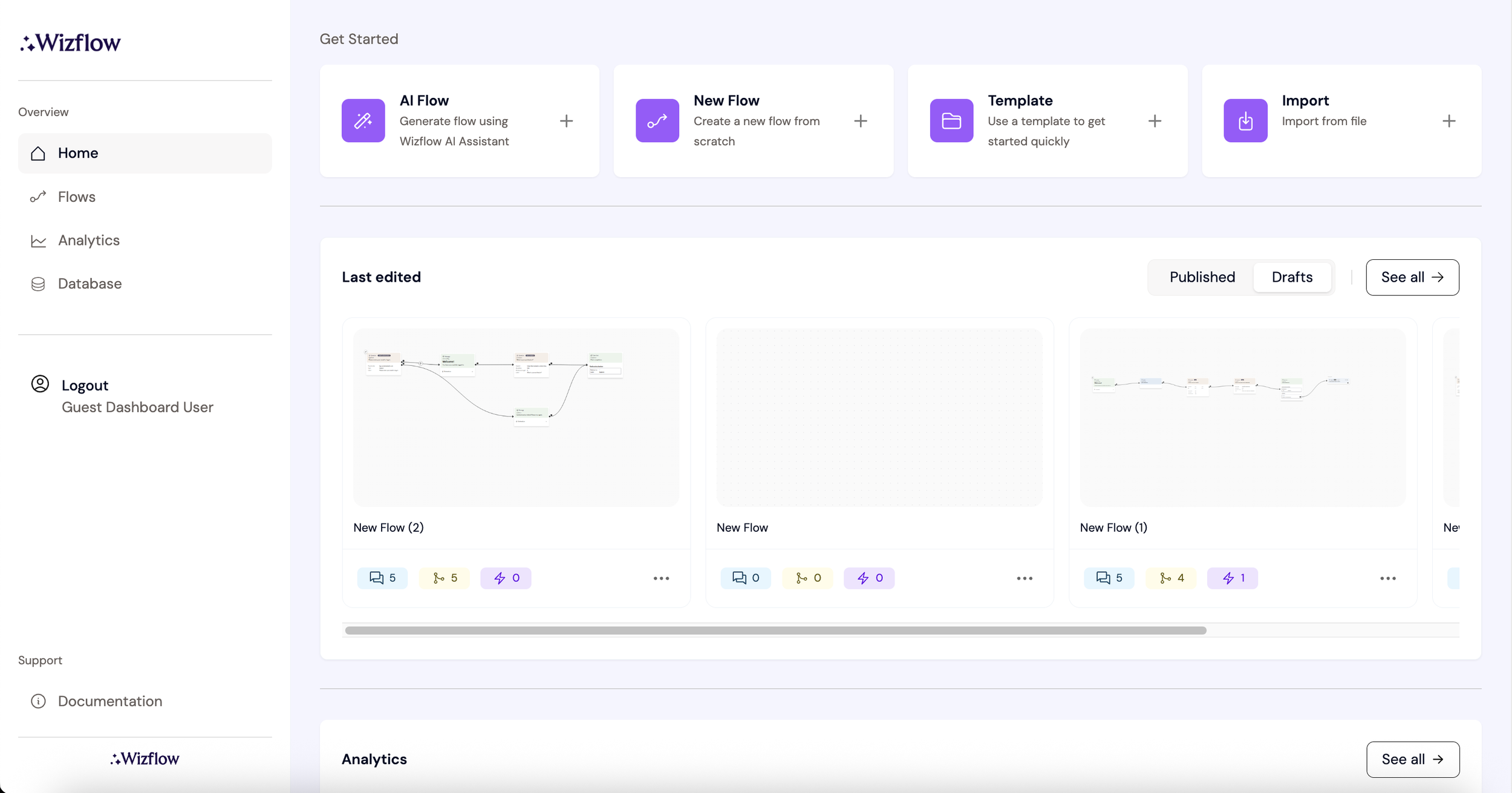
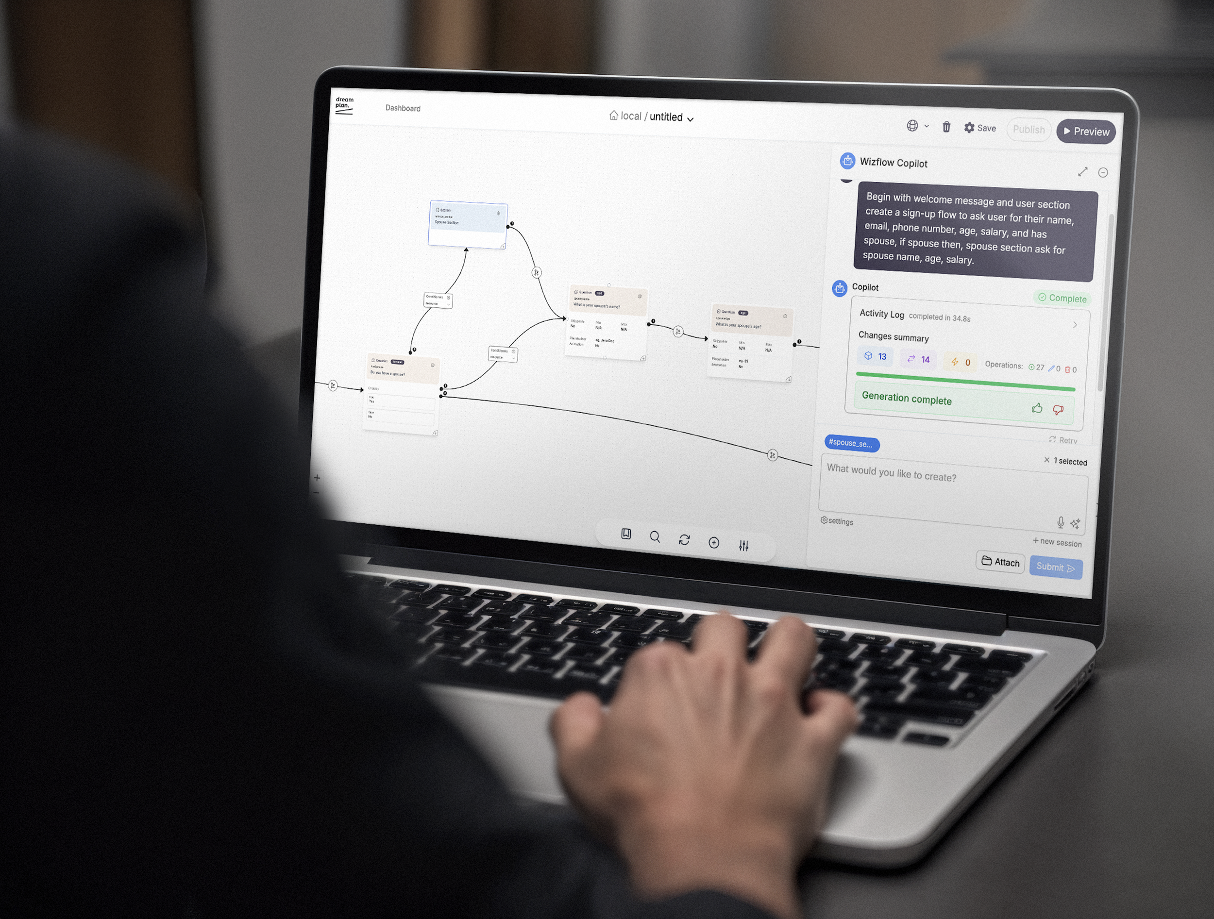
1. Visual Flow Builder
I redesigned the core flow builder into a clear, visual canvas where users assemble chatflows using modular entities.
Entities represent inputs, messages, logic, and integrations
Connections show logic and flow direction visually
Complex rules are abstracted into understandable patterns
This allowed users to see the entire journey at a glance, increasing confidence and speed.
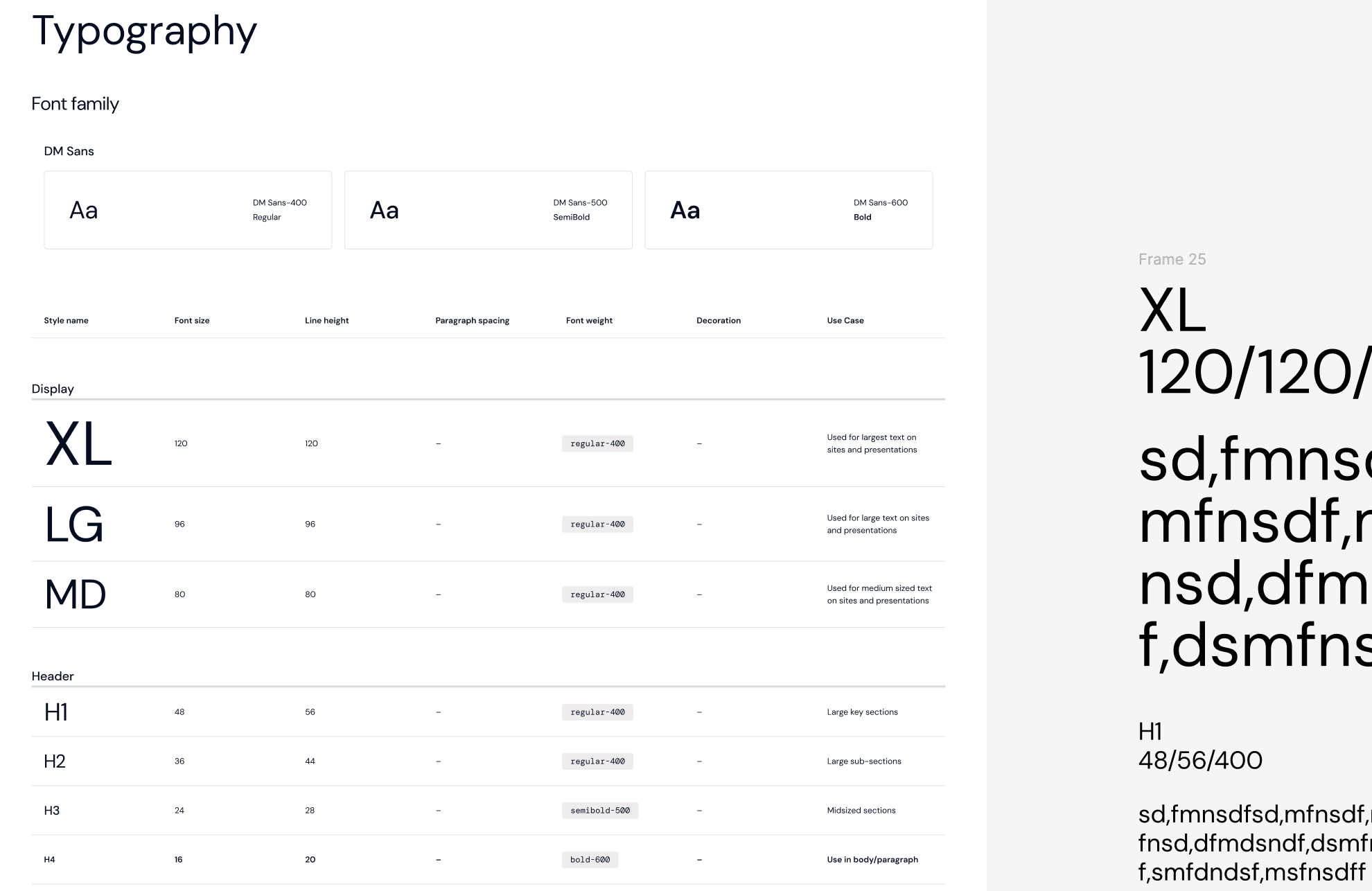
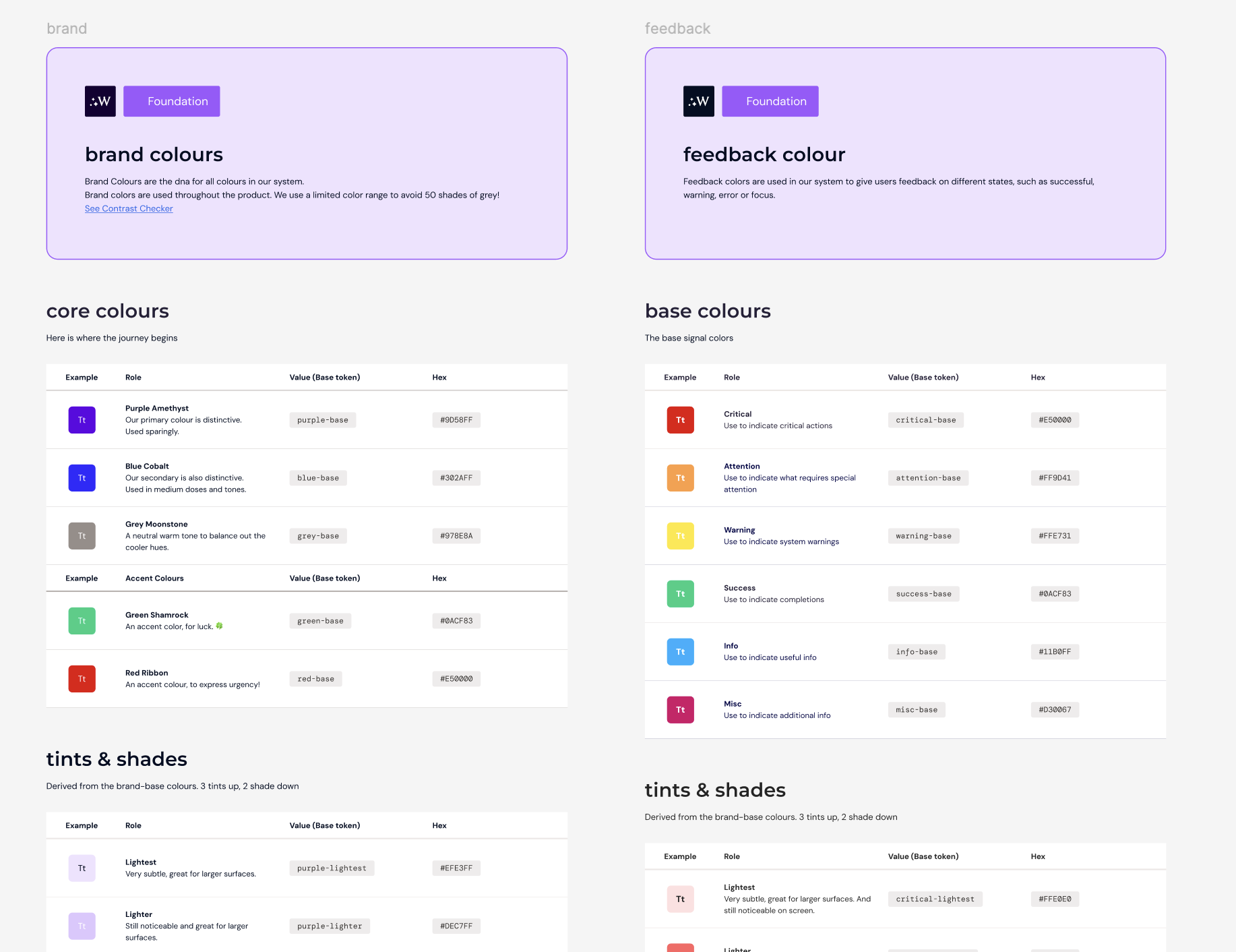
2. Design System from Scratch
I created Wizflow’s design system from the ground up to support clarity, consistency, and scalability.
Defined typography, spacing, color, and component logic
Built reusable UI patterns for entities, states, and validation
Ensured accessibility and calm visual density for enterprise users
The system unified the platform and enabled faster iteration across teams.
3. Turning Data into Visual Insight
A major focus was transforming complex data and logic into understandable visuals.
Dashboards designed around actionable insight, not raw data
Visual cues for validation, errors, and flow health
Clear states that reduce fear of mistakes
This made monitoring and improving flows as intuitive as building them.
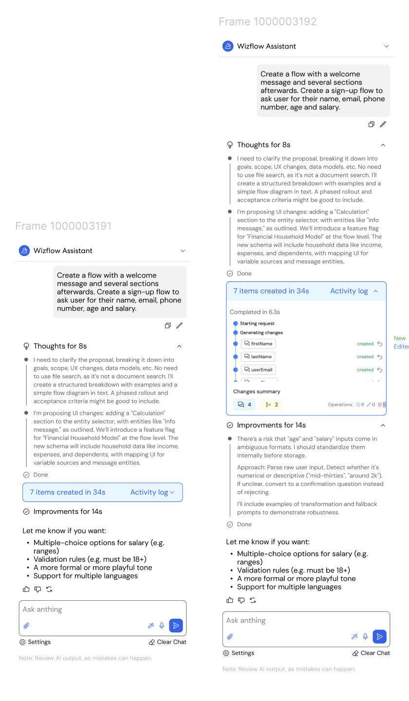
4. AI Assistant Chat (Familiar, Human-Controlled)
The AI assistant was designed to feel familiar and intuitive, inspired by tools like ChatGPT and Claude — while keeping users fully in control.
Users can:
Build flows through natural, conversational input
Generate and refine entities step by step
Understand what the AI is doing and why at every stage
This approach reduces complexity and builds trust, making advanced flow creation accessible to non-technical users.
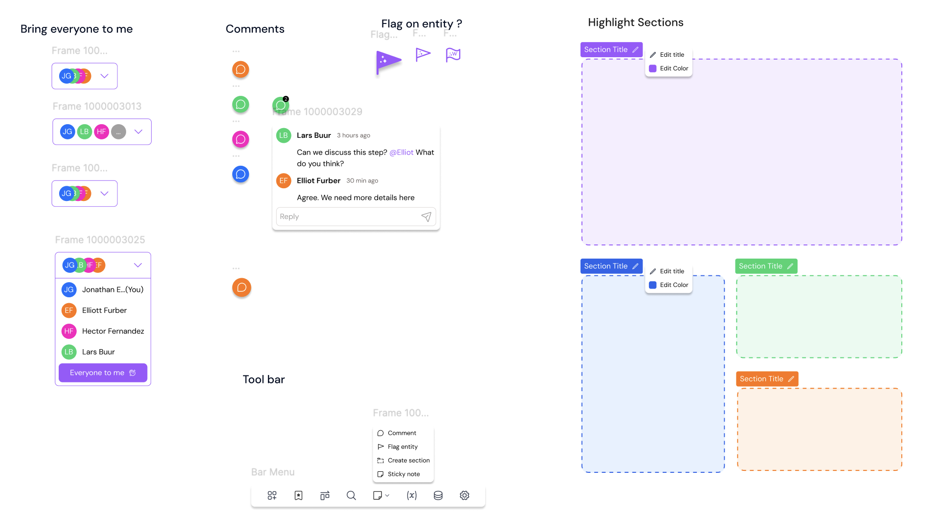
5. Multi-User Collaboration for Scale
Wizflow was designed to support teams, not just individual users.
The platform enables:
Role-based access and permissions
Secure collaboration across teams and departments
Clear ownership, visibility, and audit readiness
This allows banks and pension companies to scale workflow creation confidently while maintaining control, compliance, and accountability.

Outcome
The redesigned Wizflow experience significantly reduced onboarding friction and increased user confidence.
Key results:
Faster flow creation for non-technical users
Reduced dependency on developers and IT teams
Increased adoption within banking and pension organisations
A clearer product identity aligned with trust and usability
Wizflow evolved from a technical platform into a human-centered enterprise tool — without sacrificing power or compliance.

Next steps
Smarter, Context-Aware AI Assistance
Evolve the AI assistant to adapt dynamically to user behavior, industry context, and past flows. This would allow the assistant to proactively suggest improvements, highlight potential risks, and tailor guidance based on whether the user is working in banking, pensions, or other regulated domains.
Expanded analytics and performance feedback inside the builder
Expand the dashboard to surface clearer insights into flow performance, drop-off points, and user behavior. Providing actionable recommendations directly within the builder would help teams continuously optimize their customer journeys without relying on external reporting tools.
Continued refinement of the design system for scale and white-label use
Further refine multi-user workflows by introducing approval flows, review states, and commenting directly on entities. This would support larger teams and stricter compliance processes while maintaining clarity and accountability.
Industry-Specific Templates & Design Patterns
Introduce pre-configured flow templates and UI patterns tailored to specific use cases in banking and pension services. This would accelerate adoption, reduce setup time, and reinforce best practices across industries.
more cases?
-
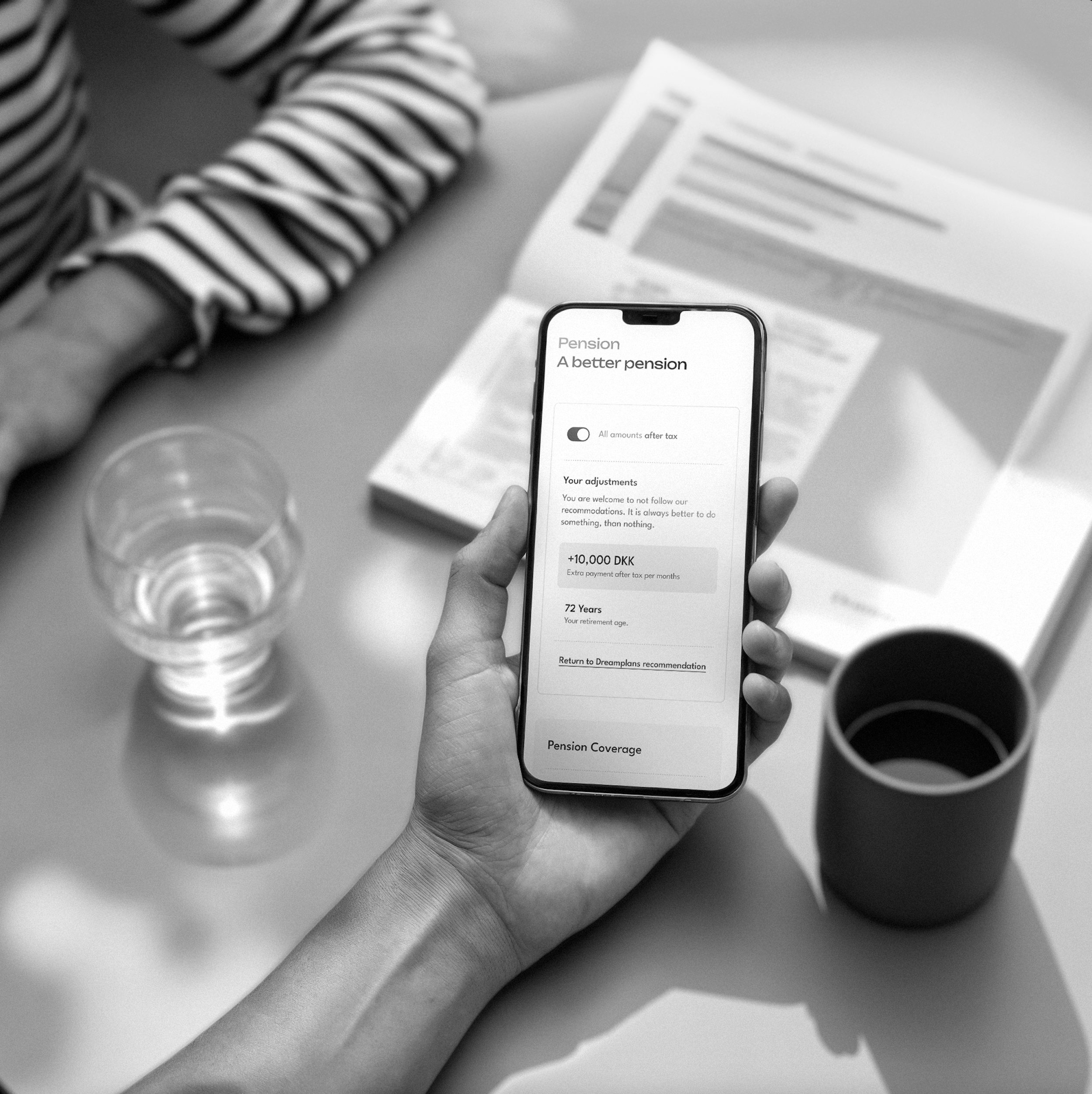
Dreamplan Platform - Your financial advisor
Dreamplan turns numbers into narratives. This case study highlights how empathetic design and visual storytelling helped simplify financial planning and empower users to make confident decisions about their future.
-

City Fashion E-commerce with A-view
The mission of the case study is to redesign A-view's e-commerce website, aiming to enhance user experience, boost online shopping satisfaction, and increase the website's conversion rate by at least 25%. The primary objective is to create a user-friendly, responsive platform that replicates the in-store shopping journey, positioning A-view as a prominent player in the fast fashion e-commerce market.
-

Carpooling App - Nabogo
Nabogo's project focused on creating a better carpool-friendly platform by identifying user needs and pain points. It involved developing user personas, mapping journeys, analyzing data & heatmaps, and refining the UI to enhance the overall user experience and support the company’s growth.