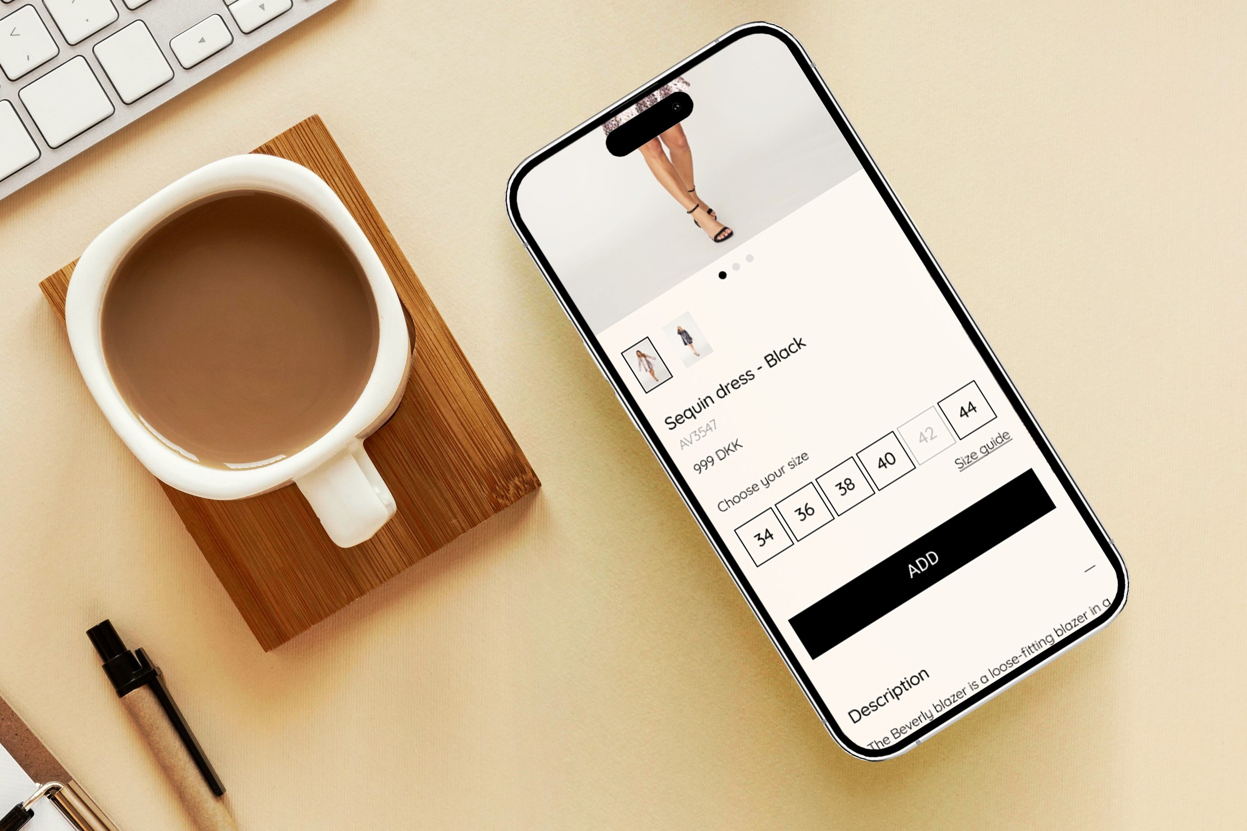
Tailored for Trends: A-View's Digital Fashion Revolution
My Role
Product Manager -
UX Designer -
UI Designer -
Client
A-view
Timeline 2023
2 months
Deliverables
User/Usability Research
Hi-fi wire-framing WebApp version and desktop version
Hi-fi prototype WebApp version
Overview
The case study centers on redesigning A-view's e-commerce site to improve user experience and online presence. The current template-based website lacks essential features for a seamless shopping journey. Objectives include user research, a user-friendly design with responsive screens, realistic product presentation, and personalized shopping experiences.
The outcome was a successful redesign that provided users with an engaging, realistic online experience, leading to increased customer satisfaction and conversion rates, strengthening A-view's position in the fast fashion e-commerce market.
Mission
The case study's mission is to redesign A-view's e-commerce site, improving user experience, increasing online shopping satisfaction, and boosting the website's conversion rate by 25%. The primary goal is to create a user-friendly, responsive platform mirroring the in-store shopping journey, establishing A-view as a key player in fast fashion e-commerce.
Problem
The challenge is to improve A-view's online shopping experience by addressing deficiencies in navigation, product presentation, website architecture, personalized user experience, and alignment with in-store shopping. Our goal is to enhance user satisfaction and increase the company's conversion rate through a website redesign.


Research
Our research begins after a stakeholder meeting where we define KPIs and establish the project scope. It includes market and competitors analysis, examination of the current website through heuristic principles, usability tests, and a quantitative survey on online shopping habits and preferences.
-
Key trends in fashion E-commerce: Personalisation, Sustainability, Resale, and Social Media.
Leading Sellers: JD, Shein, Amazon, Coupang, vip.com.
Predominantly, clothes are acquired through mobile devices.
Market expansion following the post-COVID era.
Europe secures the position as the second-largest region in online sashion sales, following the US."
-
The competitor analysis table we created offers an overview of the design and navigation elements. Through this analysis, we identified a deficiency in essential features necessary to meet our client's needs.
Competitors’ header icons include essentials like search, heart, menu, and user profile.
Competitors use animations, categorised collections, and dynamic elements for an engaging homepage experience.
Competitors display varying elements such as multiple product images, details and care information, sizing guides, and related product suggestions.
Competitors offer extensive burger menus with categorized sections, customer support, and language options.
-
Lack of visibility regarding the ability to navigate through homepage. Also in product availability (sold out or not) on the product page, affecting user decision-making.
The spatial hierarchy needs improvement for better organization and clarity.
Non-compliance with accessibility standards (WCAG) at certain points on the website.
Ineffective information structure.
Failing to adhere to the principle of recognition over recall, potentially causing confusion for users.
-
Users expressed interest in a "Quick View" feature for products and personalised recommendations.
Users feel uneasy during payment and suggest a clear cart summary before paying.
Feedback suggests a need for better sorting options, including sorting by color.
The checkout process was confusing for some, and they want it to be simpler.
Trust Pilot reviews' placement and design need reconsideration.
Users think adding a personal touch to the website would make it more engaging.
-
Demographics:
Majority are 26-35 years old, mostly female, and shop online monthly.
Valued Features:
Users highly value personalized recommendations, quality images and detailed product info
Easy returns, exchanges, and comprehensive size guides are important.
Most Important Aspects:
Key factors include discounts, clear product info, images, and transparent shipping/return policies.
Buyers prioritize price/quality and a variety of styles.
Usability Preferences:
Users want both app and desktop options, with a well-designed mobile version.
General UX:
Social media and recommendations play a significant role in site discovery.
Users value clear checkout steps, order summaries, and confirmations.
Surveys are the preferred way to provide feedback.

User Persona &
Meet Barbara, a 32-year-old Marketing Manager seeking a simple and user-friendly online shopping experience. She values clear product information and desires an online experience reminiscent of in-store browsing.
Barbara's frustrations include difficulty finding new items, messy designs, and inadequate product details. Her story reflects the quest for simplicity and joy in online shopping.
User Journey Map

Problem Statment
Due to outdated and confusing information architecture on current fashion websites, there's a need for a clear and efficient online clothes-buying experience.
The project will primarily focus on improving information architecture, refining product display, and enhancing personalized suggestions to elevate the user experience and align it with physical shopping.


Ideation
We prioritized a WebApp for mobile traffic, aligning with the visual preferences of millennials. The scrolling layout, inspired by popular social platforms, aims to create a familiar and visually engaging experience for our target audience.
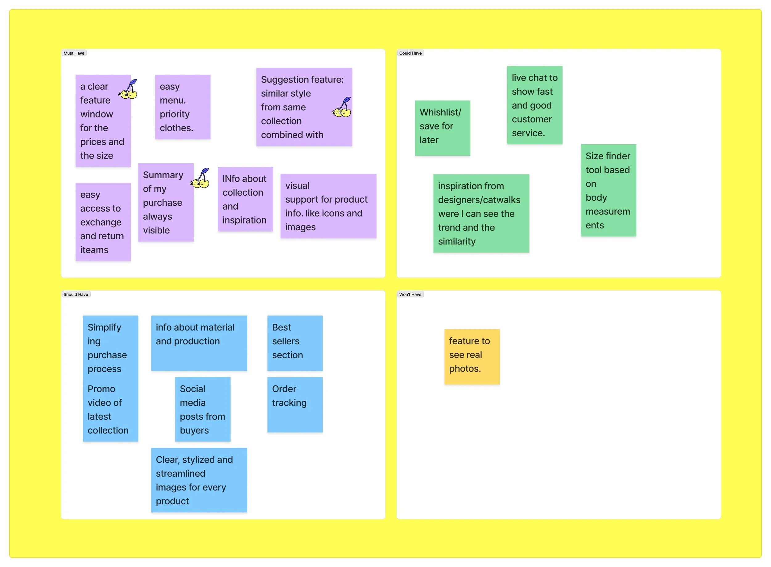
We utilised the MoSCoW method for prioritising features, providing a clear roadmap for development. By aligning priorities with project goals, we ensured a focused and efficient implementation.
-
We were including features like
Suggestion feature.
Clear Burger Menu not hiding products.
Visible access to exchange and return policy.
Clear product info and size guide.
More iconography.
Editable check out all the way.
-
features like :
Best seller section
Order tracking.
Social media from buyers.
Simpler purchase flow.
-
Chat for better customer support.
Wishlist/ save for later.
Inspiration for collection. Trend information.
Size finder tool by body measurement.
-
See real products pictures with a rating on it.
Comment section in products.
Solution
In developing the final solution, our focus was on prioritising user needs and streamlining the online shopping experience. Key features include a
- personalised Suggestion Feature,
- a consistently visible Burger Menu for smooth navigation,
- transparent display of exchange and return policies for trust,
- clear product information with an accessible size guide,
- increased iconography for visual communication,
- flexibility in editing cart details during checkout,
- a Best Seller Section for popular items,
- and a Wishlist option for user engagement and loyalty.
User flow

User flow or "Happy path" design to buy one or more products
, to Mid-Fi

After sketching in our notes and researching the optimal site map organization, we opted for a clean and straightforward look. Below, I present mid-fidelity wireframes that provide a preliminary glimpse into the envisioned structure. The Homepage, Catalog, and Product interfaces are already taking shape, showcasing an initial appeal of the forthcoming design.

, to Hi-Fi.
In the Hi-Fidelity phase, we defined core brand attributes and created a mood board to visually represent them. Testing its impact, feedback confirmed the perception of femininity, comfort, and fashion, aligning with stakeholder priorities.

Derived from the mood board, the Hi-Fi prototype features a new color palette, subtly adjusted logo, and refined typography with adjusted font sizes to enhance accessibility, maintaining the brand essence. This information informed the creation of the style tile.

After establishing fundamental components for the mid-fi, developing the Components section for the hi-fi becomes more straightforward and streamlined, ensuring consistency throughout.

UX IMPROVEMENTS
Allowing users to edit their cart details throughout the checkout process ensures flexibility.

Before:Users faced challenges in editing their cart details throughout the checkout process, leading to a less flexible and potentially frustrating experience.
Clear product information and an expanded size guide address user uncertainties.
Before: Inadequate product information and a limited size guide left users uncertain about their purchases, potentially leading to dissatisfaction.
Increased iconography for an efficient visual communication.
Before: A lack of clear visual cues create confusion and frustration
Now, with a quick look, you can see if your size is available or not.

The Suggestion Feature adds a personalized touch, resembling in-store recommendations.
Before: Users struggled with finding relevant products, leading to a less personalized and engaging experience.
Displaying exchange and return policies on each product page ensures transparency.
Before: Users had difficulty accessing and understanding exchange and return policies, contributing to uncertainties and potentially impacting trust.
Engaging homepage with vertical scrolling, featuring a Best Seller section as a promotional highlight. Wishlist option for quick access to previously favorited items.
Before: The previous homepage lacked visual appeal and easy navigations. Also users may have missed out on popular items or ongoing promotions. And without a Wishlist option, users had no efficient way to save and revisit favored items,

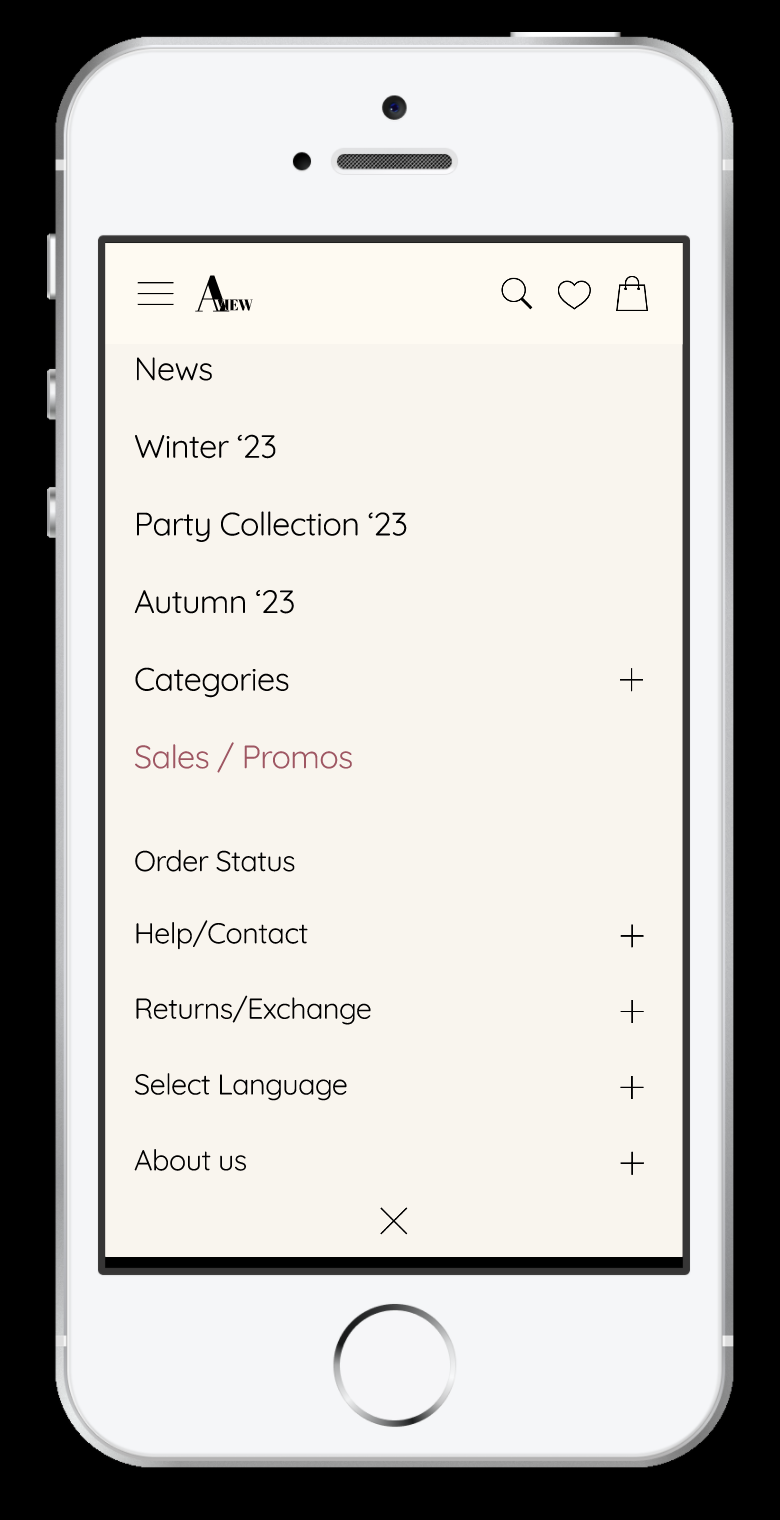
Clear Burger Menu
(not hiding products):
Before: The hidden Burger Menu caused disruptions, making it challenging for users to navigate seamlessly and hindering product visibility.
We improved UX by implementing a color code system for products, helping customers identify items with multiple color options.


We also refined and simplified the filters for a cleaner and more functional interface. Placing the "X" button at the center bottom of the frame enhanced accessibility for both right and left-handed users.


Responsive screen
One of the project objectives was to create a responsive screen. Therefore, we prioritized designing the homepage as the initial focal point, considering time constraints.

Next steps
The case study outlines key future enhancements to the e-commerce:
Customer Service Chat: A highly requested feature from the survey, providing users with a direct contact option.
Order Tracking: Introducing an order tracking feature for enhanced user experience.
Completing Desktop Design: Crafting the laptop/desktop version of the website for comprehensive accessibility.
Feedback Survey: Implementing an optional survey after purchase to gather feedback and continuously refine our UX.
more cases?
-

App-titude for ADHD.
In this case study, my mission is to empathetically craft a user-friendly and inclusive experience for individuals with ADHD. By understanding unique challenges and prioritising emotional well-being, I aim to create a solution that enhances user lives and embrace a sense of belonging.
-

Heuristic Analysis of Wish App
Explore how Wish app's cluttered interface and navigation hurdles violate essential heuristic principles. Through iterative improvements this case study showcases how the app evolved into a more intuitive, inclusive, and user-friendly platform.
-

City Mobility
This case study delves deep into the realm of urban mobility, unraveling a story where innovation, user-centric design, and real-time solutions converge. Join us as we navigate the cityscape, transforming challenges into opportunities, one commute at a time!